Hubspot Data Quality Command Center
Data Quality experience for CRM tools
HubSpot is currently one of the most exciting tools for digital marketing. However, in order to be efficient and effective, successful businesses need high-quality and reliable data.
Role
Product Designer
Year
2021-2022
Problem
Customer relations management (CRM) data operation professionals and admins lack visibility into most data quality issues and this fact alone has large implications for their organizations’ success. They are often made aware of symptoms of a significant data problem way too late, as bad data has already been used which may result in ineffective marketing campaigns, inefficient sales processes and results, incorrect reporting, and therefore wrong business insights.
Goal
My job was to help define the scope of the problem and propose solutions so that HubSpot customers could start moving from a reactive and painful attitude towards data quality issues to a more proactive one, where they get early visibility and control over the different potential issues in their organization data as well as a set of tools and actions that can effectively mitigate them and make people and processes more efficient.
Research
What did we learn from the Research?
The research team ran a series of studies, surveys, and customer interviews with the intent to learn and identify the leading data quality issues admins and operations professionals face in their roles and organizations. Here are our main insights:
Data source, usage, governance, and age were the leading indicators of Data Health.
To understand data quality, customers needed to be able to answer where the data came from, who generated it, what is using it, and when was it created and updated.
End users were usually the ones noticing signals of Data quality issues.
Some examples include discrepancies in reporting, bounced emails, wrong phone numbers for contact, and the wrong person at a company. How can we make them visible to Data managers, Operations and Admins?
Technology can be leveraged for good data health if set up well and intentionally. Alerts, data quality reports/dashboards, property and workflow management, duplicate prevention, form validation, sandboxes/testing infrastructure, data enrichment & anti-bounce checks.
Competitive analysis
Our competitive analysis showed that Data Management was mostly handled by third-party tools or plugins. Salesforce was a strong and well-established competitor, but its integration and configuration were laborious, the usage was convoluted, and didn’t support some of the use cases. The cost was also an important factor since most features were part of add-ons that customers needed to purchase separately.
Third-party tools like Insycle or Validity provide robust solutions for specific data transformation use cases such as de-duplication and data formatting but require customers to either set up new workflows and processes or export and re-import their data, which adds friction and cost and an obvious dependency to external organizations development schedules.

Recommendations
Provide a centralized place to monitor data quality and take action.
HubSpot provides a set of critical tools that impact customers’ data: Individual records, Property settings, and Integrations. Without a centralized place to view this data or prioritize, ops teams are left overwhelmed and reactive to issues that arise in the CRM.
Focus on making the invisible visible such as formatting issues and CRM property health.
Admin/ops operate in a deluge of data and requests – new records, new data sources, new processes and process changes, property requests, and business intelligence questions. With all of this new data from different sources, it is difficult (and a very time-consuming manual process) to catch bad data or a setup that isn’t serving the team.
Prioritize insights and metrics on CRM properties, records, and integrations.
Since the core data on the CRM are properties and records, we understand that they are an excellent place to start as many other objects make heavy use of these objects. Fixing them has a positive downstream impact.
Design
Brainstorming
We did some initial exploratory design work that expressed the research recommendations as a base framework for future co-design sessions. We collaborated across multiple teams and developed one initial idea, composed of the main dashboard where we displayed different possible data quality themes as well as ways to access more detailed information.

Co-Design Sessions
Given what we learned from the research team we wanted to start by inviting customers to a collaboration board and walk us through their business model, their process and pain points, so that we could understand their specific needs, common patterns and validate our initial designs.
Customers had the chance to define their most important data quality needs, add or remove themes to better suit their use cases. In the end they could play “project manager” where they had a finite amount of dollars to place on their themes or features so they could give us their perspective on potential priorities for the near future.

JTBD (Jobs to be done)
After we ran the co-design workshop with five different customers we extracted all the Jobs To Be Done from these interviews, categorized and came up with a prioritized list of themes and features to be integrated into one experience. Although we had more than ten different themes, it was clear that for this initial work we should be focusing on providing visibility into data quality issues in the CRM properties, records and data sync, aligned with the most important issues to be solved for the customers.


Low fidelity and Requirements
As we were moving towards a more well-defined design draft we started generating a map of all the data quality metrics needed, and any potential dependencies as engineering requirements. This organized feature list was used as a core collaboration artifact for discussions with the engineering team while we still had low-fidelity sketches of what the experience could entail. This allowed us to make quick decisions regarding what the MVP could look like and start transitioning to higher-fidelity designs.


MVP Design
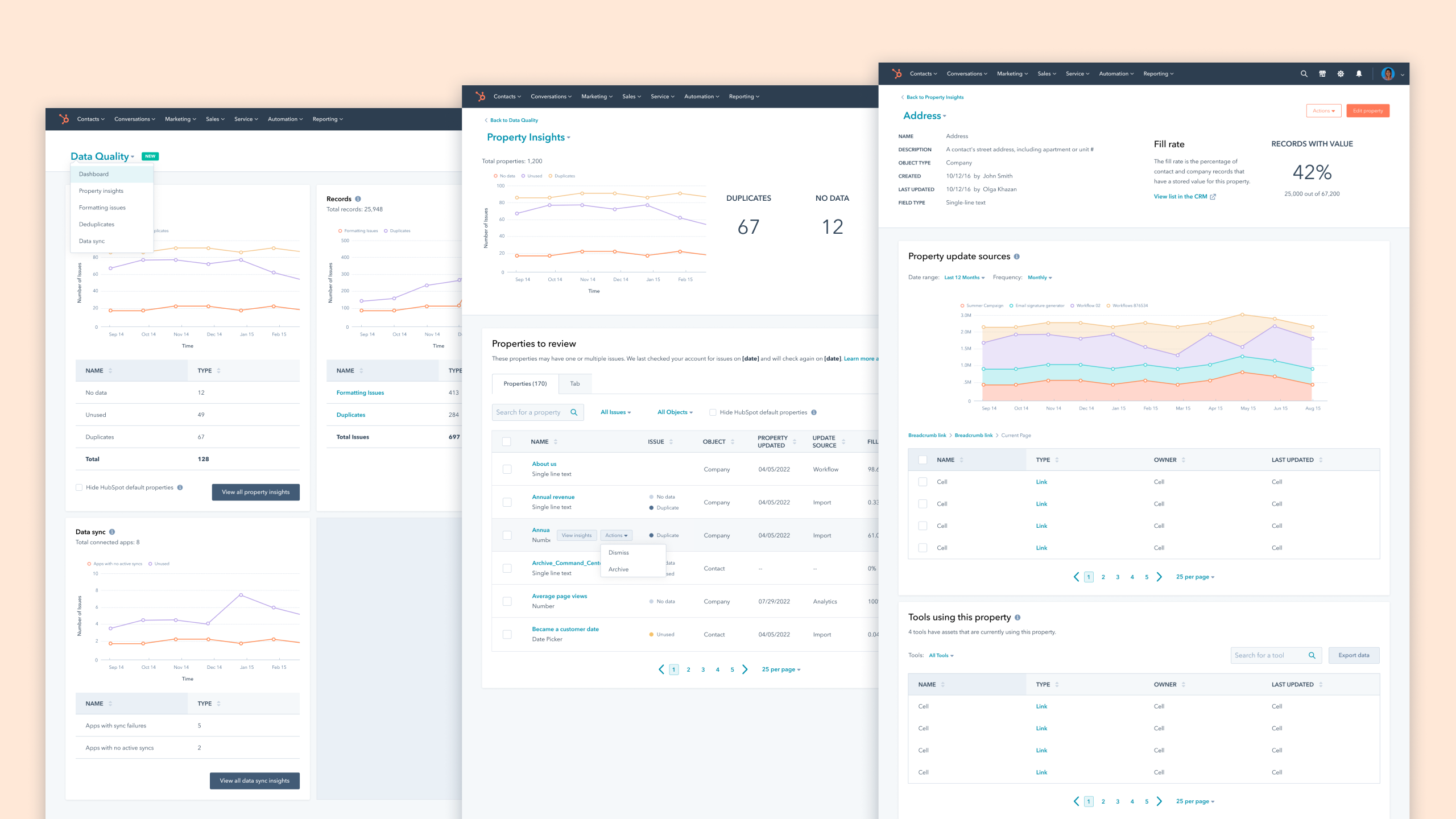
Our proposed design consisted of a home dashboard, object insights, and single object details, whenever possible. We called it Data Quality Command Center, which could be accessed through the top navigation and where customers could have access to:
high-level quantitative information (Dashboard), object-level insights through data tables with the most important metadata (e.g. Properties Insights: type, last updated, fill rate) and could still drill into each object instance (e.g. Address) and get even more details such as update volume over time, possible duplicates, used by, creation and update date and user.
UI Design, Iterations, and Refinements
At this point, we started to refine and iterate on earlier ideas and drafts. Created iterations of potential designs and data structures that could satisfy what we previously heard from customers.

We gathered feedback from a set of customers through design walkthroughs and interviews to not only test our assumptions but also guarantee that content copy and terminology were correct, accurate, and matched user expectations.
We got valuable feedback that allowed us to make important refinements to the interface and work on additional elements such as introducing trends, new metadata, UI improvements, and an onboarding experience.
Final Designs
Data Quality Dashboard
The data quality home presents high-level metrics on common issues for different data types as well as how they trend over time.

Property Insights
Customers could access the most important metadata on all the CRM properties. Property Insights support further identification of problematic properties and some level of decision-making.

Single Property details
This page provides a quite robust level of understanding of how each property is being used, any possible duplicates, what sources are updating it, and how frequently.

Data Sync Insights
Provides a new view of the data health across all the Data Sync integrations so customers can identify any issues with incoming and outgoing data.

Onboarding
We created an onboarding experience so that we could introduce current and new customers to the new tools while also providing some level of orientation on best practices.

Results
Customers had been telling us how useful this new product area is throughout the entire product design and implementation process. And this project is the perfect example of building a product for customers. It was massively important and valuable to understand their pain points as well as where we could provide the most initial value.
The Beta version provided us with a unique opportunity to get closer to our customers. We gradually opened the Beta to approximately 250 customers and got to chat through slack and in interviews which provided a huge value and the team’s confidence that the product had quality and was meeting expectations.
After we made the changes according to the final design we saw the following average metrics per portal:
The average number of misformatted records across subscribing portals decreased by 35%
This meant that customers were positively reacting to the data metrics indicators and consequently using the tools to resolve formatting issues.
Single properties page traffic increased
During the Beta stage, we found some discoverability issues with accessing the single property page. After we implemented simple design changes we saw the traffic increase significantly.
What we heard from customers
It’s really important in my role (CRM/Automation/Nurture) to see where we have flaws in the database, and to be able to action these insights is wonderful! Truly a great feature here, congrats!
Love this! Without it, I was downloading and trying to do this manually! Puts it all in one place that’s easy to work with and visual to see how we improve. Thanks HubSpot!
It looks nice and clean, easy to use.